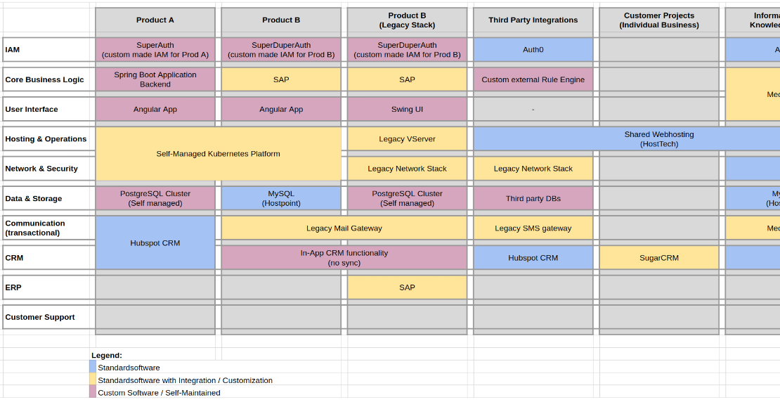
Example Application Landscape, created with Google Sheets
In enterprise & solution architecture, connecting boxes with arrows is an often used and overrated visualization
from high-level, thru component architecture, down to data and class diagrams. However, to create a holistic view on
systems, component diagrams are not enough! When it comes to analysis or transformation of a high-level application- or
service-architecture, I prefer to draw an Application Landscape Diagram, which I would like to show and elaborate
on in this post.
Definition & Dimensions
Template file with highlighted dimensions
The template shown above is a simple matrix with two dimensions. Later, more will be added, but first, it is crucial to
understand or define the X and Y dimensions. In a detailed design, the diagram can be used in different ways, and
everyone working on it should have a common understanding of the taxonomies.
Products
The vertical columns (blue) visualize products or services. Some say business lines, for SaaS platforms, for example, it
makes sense to talk about applications or modules. For architects or consultants the term “services” would probably be
more appropriate… Whatever the dimension is called, it should be an explicit name and all stakeholders should
understand it the same way.
While we should try to keep products as high-level as possible, overgeneralization makes no sense at this point. In the
later application, we want to find out how similar products differ technologically. You only have one product? That’s
rarely the case. You can use customer segmentation here or differentiate by legacy and follow-up implementation.
My recommendation here is to start broadly and then gradually eliminate intermediate layers.
Functions
The horizontal rows (green) denote functions, some say features, components or modules. With the last term “modules”
something becomes very clear: Explicit wording is indispensable because otherwise, there is room for interpretation
whether e.g. “module” means a product or a function.
While there is general functionality used in and by most companies (e.g. IAM, CRM, ERP), this can also be branch-typical
or specialized functions that are needed or shared across products. Examples could be PIM and payment gateway for
commerce platforms, hardware-control software for some industry segments or dispatching applications for service &
delivery companies.
While I personally don’t recommend this, some use the 12 application factors here as a general-purpose
solution. I appreciate the 12 factors concept, but for this purpose, they are overgeneralized and in the same time, too
technical to generate real value.
Color Codes
While color codes can be used for very different aspects, I often prefer them to indicate the level of customization for
each application. Custom or customized applications are not bad by default but often pose an architectural difficulty
or risk in terms of maintainability, testing, and extension. I therefore use blue for standard software, yellow for
standard software with integrations or customizations, and red for entirely custom development.
Visual Conclusions
Once you have defined and agreed on the dimensions and their naming, the chart can be filled with the corresponding solutions,
technology, applications, or providers. The process is rather simple: For each solution or technology in place, a box
(colored) is created. The boxes are connected where technologies or implementations span multiple applications, functions, or
both. Since the order of products (left to right) or functions (top to bottom) has no purpose, the rows and columns
should be arranged so that as many commonalities as possible can be visually represented.
Because I’m sadly not able to provide a real-world example due to data protection
and NDA, the following constructed situation should serve as an example. All products, suppliers, and brands mentioned
in the diagram serve the sole purpose of illustrating an example. I am, however, not affiliated with any of these
companies or brands.
Filled example chart of a constructed digital environment
Looking at the diagram above, we’re able almost instantly to draw spontaneous conclusions and improvements to the overall
architecture:
Unified IAM
Filled example chart of a constructed digital environment
It is almost impossible to overlook the fact that identity and access management have been set up separately for each
product. Centralizing the IAM infrastructure is an obvious solution, as it not only saves costs but also creates a
uniform user base.
Database & Provider Fragmentation
Filled example chart of a constructed digital environment
We use the same database technology in the three columns on the right but with different managed providers. Unifying the
providers would be potentially easy to realize and could save maintenance as well as administration effort. Also, the
Postgres instance on the left could potentially be integrated and migrated into one single database provider.
Shared Hosting Platform
Filled example chart of a constructed digital environment
As some of the products use different shared hosting platforms to provide their services, they could be unified into
one. Taking the CloudFlare CDN / caching layer into account, one could even consider providing and delivering the
application directly on the edge of the CDN, so the whole annotated area could be served by one single provider.
Tools
Depending on the tool used, this can take some serious time. Even if I am a friend of whiteboards or pen & paper, I
really recommend to work with a digital tool to be agile and to ensure traceability.
As one can see from the images, I obviously used a simple spreadsheet (in this case
Google Sheets) but Excel or
Open Office Calc would be equally sufficient. If spreadsheets are too
old-fashioned, or you just want to be more creative, Miro or literally every “digital piece of canvas”
is a good alternative. Also, depending on the company and customer, there’s probably an enterprise architecture tool in place.
Most of them should provide similar capabilities.
Closing Words
Please keep in mind, especially business people, that this is only a visualization technique. It doesn’t replace skilled
and experienced solution architects, but probably helps them to analyze or communicate more efficiently.
Although the principle and the document look very simple, the technique works even for large corporate organizations. I
actually have customers who have such diagrams printed on posters on the office wall. However, as with all architecture
and transformation processes, the application landscape should not be a one-off initiative. The technology only offers real
added value, when the status quo is continuously analyzed and improved. Last but not least, the chart is suitable for
visually comparing the current with the target situation and deriving architecture initiatives from this. Once an
initiative is done, don’t forget to update the chart.
I see myself as a curious problem solver. On a life-long mission to enable people, improve tools and optimize processes, I build software to make things work. Moreover, I like to talk about technology and sharing know-how in a team to improve my own …
While OIDC and OAUTH are well-known standards, they don’t fit every purpose “out of the box.” In businesses with special
regulations like banking, health care, etc., non-functional requirements to auth can be challenging. Different
solutions and ways were evaluated to create a new identity provider for a medical network. The first approach was “just”
using simple OAUTH by its most famous Authorization Code Flow. Of course, it failed fast, and I’ll show why and
how we solved it in this post.
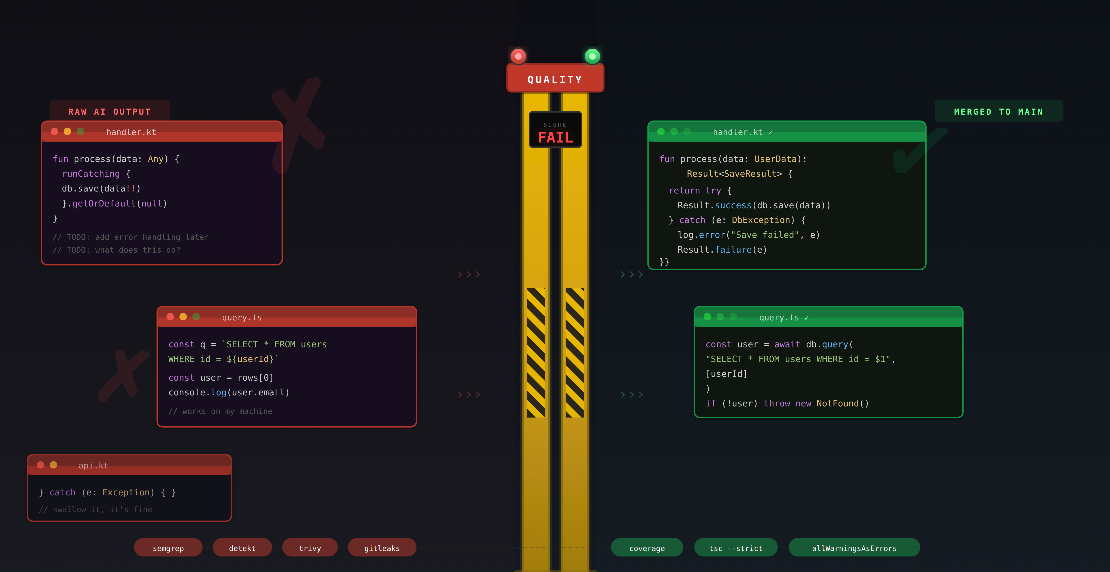
AI coding tools let your team ship faster than ever. That is the pitch, and it is not wrong. But nobody talks about
what you are shipping. Right now, most teams use these tools to produce broken software at unprecedented speed.
Security holes, silent data corruption, exception handling that hides failures. None of this shows up in your sprint
velocity. It shows up when the product collapses under technical debt, or when a customer hits an unhandled edge case in
production. If your team uses AI coding tools without guardrails, you are not moving fast. You are accumulating
landmines.


 Frank Neff